Software releases
reMarkable 2.0 software update: new user interface, home screen, gestures, and sharing options
We’re incredibly happy to share with everyone one of the most significant software updates we’ve released: reMarkable 2.0 software.
As always, it’s been an enjoyable process working alongside our engaged community to continue improving our product, and the overall user experience. This latest update brings not only a clean and organized new look, but some new functionality as well.
NB: This update will roll out to reMarkable users over the next weeks.
Here are some of the highlights:
- A brand new user interface
- A new home screen design
- An improved document toolbar
- Touch gestures
- Long-press to select
- More sharing options
Home sweet home
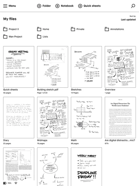
The first thing you might notice in conjunction with the new user interface is the new home screen. The home screen has been given a cleaner look and reorganized to make it easier to find what you’re looking for. You’ll find a simpler home screen toolbar along the top, featuring a new menu button that reveals your filters. This leaves more space below for viewing all your important content.

More space to create
Tap to open a document or notebook, and you’ll see all the options to do with creating have been gathered in a single, streamlined toolbar on the left, or right-hand side depending on which side you favor. The redesigned toolbar includes all the same tools as before, although the new design features a clearer tool overview, and gives you more space for your work.
Gestures touchdown
The reMarkable 2.0 software marks the arrival of navigation gestures to the reMarkable user interface. You can use gestures to navigate within documents. Just swipe to the left to go to the next page, or right to return to the previous page. Swiping left when you’re on the last page of your notebook will add a new page. You’ll now be able to turn pages while reading ebooks and documents with a simple swipe, though the buttons will still work if they remain your preferred option.
Introducing the long-press
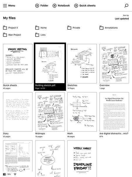
What was formally the ‘three-dot’ menu has now been replaced by a long-press touch gesture. Instead of tapping the three small dots to bring up your options menu, you now simply hold your finger down on the relevant folder, document, page, or notebook for a few seconds.
You’ll be able to tell the item has been selected, because it will be highlighted with a black border. To select additional items, there is no need for another long-press, just tap the extra pages, files, or folders you need. You can also long-press with your Marker.

More sharing options
The reMarkable 2.0 software also brings some new functionality with regards to sharing your work. This latest update makes it possible to add more than one email recipient when sharing your work, and add a message before sending.
Another new feature is the option to set a file name, and send the document as either a PNG, SVG, or PDF. It’s also possible to change the document format, or go back and edit your content without having to start the process again.
Thank you for reading and following our updates. If you’d like to learn more about our latest update you can read the full release notes here or go to our webshop to purchase your reMarkable today.
Best,
The reMarkable team


