Software releases
Release 3.9: Handedness and headlines
This smaller release improves palm rejection for lefties, adds a new serif font for titles, and cleans up the settings on your paper tablet.
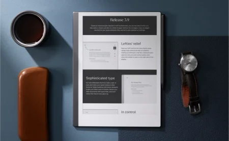
Just in time for the holidays, software version 3.9 cleans up old clutter while sprinkling in a few surprises.
In this release, we’ve improved the technology that recognizes when you’re leaning on the display or pressing the close button in left-handed mode. We’ve introduced an elegant new serif font for typed headings, designed to make content stand out. In Settings, we’ve tidied up so you can update all language and keyboard preferences and find your account details in the same place, and see what’s toggled on or off.
Learn how to update your reMarkable
Lefties’ relief
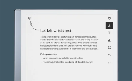
Your paper tablet features technology commonly known as palm rejection. This is the behind-the-scenes magic that tells your palm and your Marker apart, letting you rest your hand on the display as you write or erase.
Palm rejection is especially important for people who are left-handed. If you count yourself among the sinister 10.6%, you’re probably all-too familiar with smudged palms and smeared ink. Thankfully, that’s never been an issue on reMarkable — however, we’ve heard from some left-handed users who report accidentally closing a notebook or document when they’re writing.
We have good news: Version 3.9 improves palm rejection for users who are left-handed. You can now rest your hand on the close button when taking notes without the fear of suddenly finding yourself back in My files. Improved palm rejection lets you work uninterrupted, even when the toolbar is open on the right side of the display.
Sophisticated type
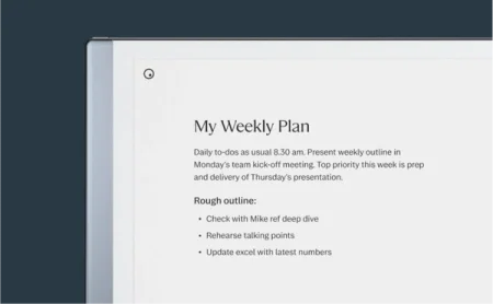
Our new font, reMarkable Serif, adds a dash of style to your typed notes. This font is only available for titles, which makes your headlines stand out by striking a contrast with the sans serif font used for subheadings and body text.
Revisit your older documents with typed titles, and you’ll notice that they’ve had a glow-up. To keep things consistent, we’ve also brought the serif font to our mobile and desktop apps.
Read more: Using typed text on your reMarkable
In control
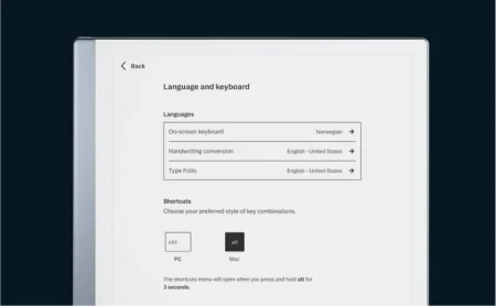
Version 3.9 cleans up the settings structure on your reMarkable. Options under Help, Language settings, and Keyboard settings (for you Type Folio owners) can now be found under General settings.
If you need to change the language for the on-screen keyboard, handwriting conversion software, and Type Folio, just tap “Language and keyboard” in General settings. Tap “Help” to see compliance statements, copyright information, and licenses.
Subtle updates to the design should also make it easier to see what you’ve toggled on and off. Turn a setting on, and the toggle will display a checkmark.
Read more: Settings
Other improvements
The reMarkable desktop app is on the move. After introducing new note-taking and productivity features, including the selection tool and checkboxes, we’re making the app available in the Mac App Store. Make sure to download it to your Mac to ensure that your reMarkable app keeps getting all the latest updates.
Windows user? Sit tight. We’ll make the app available in the Microsoft Store soon. For now, you can download the app under “Devices and apps” on my.remarkable.com.
Speaking of the selection tool — it’s even better in version 3.9. After you’ve selected handwritten notes, you can now hold Shift to edit your selection. Click and drag again to unselect lines and annotations you don’t want to move or scale.
Read more: Selection tool (copy and paste)
Thanks for following our software releases. To learn more about our latest software and how to use the new features, you can read the full release notes for version 3.9.
