Software releases
Release 3.12: A more organized My files
In this release, My files gets a spring-clean with new thumbnails, quick settings, and a streamlined way to search and create.
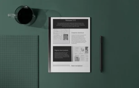
In your office, you can reach for the spine of a book, find what you’re looking for with a quick glance, and scribble down what’s on your mind. With software release 3.12, we want to make it just as easy to search, manage, and record ideas on reMarkable.
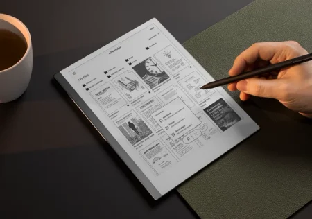
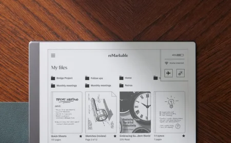
We’ve given My files a modern look and feel, so you can create a new quick sheet, notebook, or folder more efficiently. The overview is less cluttered, so you can work without distractions. Find two new shortcuts at the top of the display: a control center with quick settings accessible via the battery symbol, and a shortcut back home in the reMarkable logo.
No update available? Here’s why.
By default, your reMarkable will download updates automatically when they become available. If you see the message “Your device is up to date” when you check for updates, stay tuned.
We gradually roll out new software, starting with a few devices, then expanding to more and more users over the course of a few weeks. This way, we create a smooth experience for everyone — and make it easier to fix bugs, should any pop up.
Learn more about how to update your reMarkable and how reMarkable rolls out software updates.
Creative shortcut
When you turn on your paper tablet after updating to version 3.12, you’ll be greeted with the more organized My files overview.
Before, the buttons to search and create new folders, quick sheets, and notebooks were at the top of the display. In version 3.12, we’ve moved them to the bottom of the display. Tap the plus icon to make something new, and the magnifying glass to search your files. Pro tip: long-pressing the plus icon also opens a new quick sheet.
You’ll notice that the new menu contains brief descriptions of what you can use folders, quick sheets, and notebooks for. We think this will be a big help to people who are new to reMarkable and creating and organizing content for the first time.
Digital dust jackets
Redesigned thumbnails in version 3.12 let you identify different file types at a glance, for an overview that looks a little more like your office bookshelf.
In My files, notebooks and quick sheets now have a spine on the left side of the thumbnail; PDFs have a dog-eared upper-right corner, and ebooks have rounded corners on the right side. Note that these new thumbnails only appear when you’re viewing your files as a grid, not a list.
To keep things consistent, we’re bringing the new thumbnails to the desktop app and mobile app as well. So no matter what device you’re working on, you’ll quickly recognize your files.
New navigation
Centered at the top of the display, you’ll now find the reMarkable logo. It works as a home button — tap it, and it takes you back to the top of My files, no matter how deep into your folders you’ve dived.
In the upper-right corner of the display, you’ll see the new battery symbol. Tap it or swipe down with one finger to access quick settings, where you can manage Wi-Fi, toggle features like Screen Share and flight mode, and check your battery status.
You can also access quick settings from notebooks, quick sheets, PDFs, and ebooks. Since there’s no battery symbol when you’re viewing a file, swipe down from the upper-right corner. If you’re left-handed, and the toolbar is on the right side of the display, start the swipe just to the left of the toolbar to open quick settings.
A note on old software versions
Earlier in June, we ended support for software versions 3.4 and older. This essentially means that devices running these software versions can no longer connect to the reMarkable cloud.
If you’re running version 3.4 or older on your paper tablet, you won’t be able to sync files to reMarkable cloud (but features like handwriting conversion and Screen Share will still be available). Versions of the apps running this software will stop working entirely.
We support the three latest software versions released for our paper tablets and apps. If one of your devices is running old software, we’ll email you 30 days in advance of us ending support for it, giving you plenty of time to update.
There’s an even easier way for you to never have to worry about whether your software is supported: turn on automatic updates on your paper tablet and in the apps, and you’ll always receive the latest features and fixes.
You didn't see anything
When we started rolling out version 3.12, the release notes on your device originally included an “Other improvements” section describing a way to sort your files by when they were created. That feature didn’t quite make it into version 3.12, but stay tuned — and sorry for the confusion.
Thanks for following our software releases. To learn more and find how to use the new features, read the full release notes for version 3.12.
