Inside reMarkable
The reMarkable experience
Balancing the simplicity of paper with a high-tech tablet is no mean feat. This is how we do it.
How do you take something really simple, and make it better not by adding more, but by stripping it down?
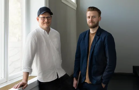
It’s a question reMarkable’s VP of user experience, Brynjar Barkarson, and VP of visual design, Didrik Rasmussen, often consider. For them, improving reMarkable’s user experience is about finding the right balance between modern functionality and simplicity.
Paper is simple and doesn’t distract, which is why it’s their strongest UX design influence. But Barkarson and Rasmussen need to balance that simplicity with modern functionality to unlock paper’s full potential.
According to Barkarson, this blend of the simple and the modern places the paper tablet squarely in its own category: “reMarkable doesn’t distract you, and in that sense it’s a unique tech device. So we need to develop our own paradigm when it comes to our user experience.”
“There’s something very interesting about paper and its tactile feel that we want to maintain. But we want to incorporate it into the digital world.”
Less is more
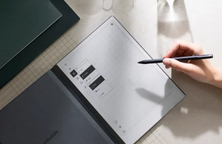
“We’re always trying to look at our user interface with new eyes,” says Barkarson. “ We’re thinking about how we can focus more on user content, and streamline reMarkable’s design – rather than add to it.” Maintaining a heavy focus on user content means they have to carefully consider what they add to reMarkable, and what they leave out.
Some people might wonder why reMarkable doesn’t have email, a video player, or a browser. “It’s tempting to constantly add new features,” says Rasmussen. “But how do those things fit into the reMarkable experience?”
“We want to keep reMarkable a distraction-free zone, where you can focus and do deep thinking,” says Barkarson. “So we introduced Read on reMarkable, for example, which lets you ship your articles from Google Chrome to your paper tablet, and read them in a more focused way.”
Design, test, repeat
Designing a button-free tablet is a challenge. reMarkable needs to respond to hand gestures, as well as our Marker. To do that, reMarkable analyzes the position, velocity, and area data generated by the Marker or your hand, and uses it to determine how you want to interact with the tablet.
“What’s the difference between when you’re using the Marker, and when you’re using your hands? Those are completely different tasks, and the software needs to accommodate both scenarios.”
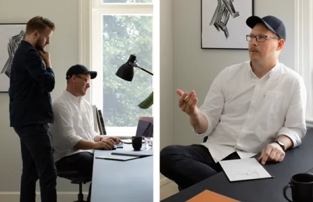
Getting this type of thing right requires close collaboration with developers, along with rigorous user testing. During the development of gestures, for example, the team spent time adjusting the acceptable angles and distances for finger swipes to find the right threshold for triggering actions.
“We have had so many rounds of testing on gestures,” says Barkarson. “Seeing what people think when the software goes live is really inspiring, but it’s also another source of data we can use to keep getting better.”
Looking ahead
While Barkarson, Rasmussen, and the team think reMarkable’s spartan user interface is a great blend of simplicity and functionality, they know they’re not finished. There’s always something to improve, and the team’s always planning what’s next.
As Rasmussen says, “We’re so excited about the future.” Barkarson continues, “We get so many ideas and feature requests from the reMarkable community, and we have so many ourselves. It’s going to be so interesting seeing people’s reactions as the user experience continues to evolve. I can’t wait.”
